I've never been majorly invested in social media or mobile video games, but over the past year or two I (and many others) have still noticed that I end up wasting a lot of time getting distracted by push notifications, alerts and other digital clutter. I started by getting rid of the easiest ways to unconsciously waste time. The focus of this purge was to work toward interfacing medium and long-form reads of high quality writing and avoid the 10-30 second browsing of content. I got rid of the Instagram account that I barely contributed to but still found myself opening without intending to spend time that way. I converted some of my friends off Facebook Messenger so I could at least remove the app from my launcher. My Facebook had been long dead but I got rid of Tinfoil for Facebook well before the revelations about the extent of the company's data collection ethics. I narrowed down my RSS aggregator to get rid of news sites. I silenced Slack and IRC channels. I blocked noisy emails. While this had gotten me away from pulling out my phone in awkward situations, but I still felt frequently distracted while using my phone. My detox could use some improvements.
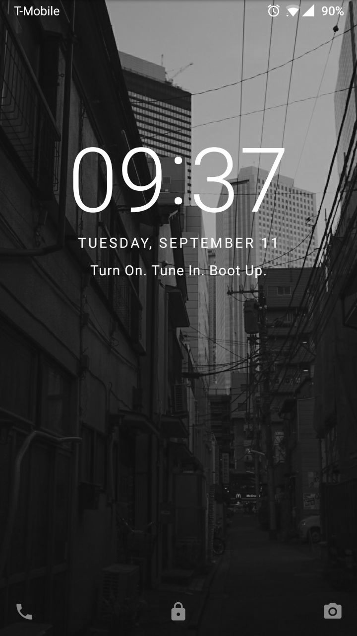
Articles about the prevalence of attention-grabbing notifications like this one in the New York Times Magazine brought my attention to the time-wasting aspects of even mundane notifications. The use of color to regulate attention (blue) or sleep (orange) had also come to mind. I have used Flux/Twilight for about a year and found it soothing. Looking at a screen without some level of orange hue almost hurts my eyes now. It wasn't until an article from Mozilla and the related Lifehacker guide popped up on hackernews (surprise). While one can generally find the setting in the Accesibility menus of a given device, I found the setting on my Nexus 7 and OnePlus 3T within the Developer Options by selecting the Monochromancy choice for Simulate Color Space. See all of the instructions I used cross-platform, below.
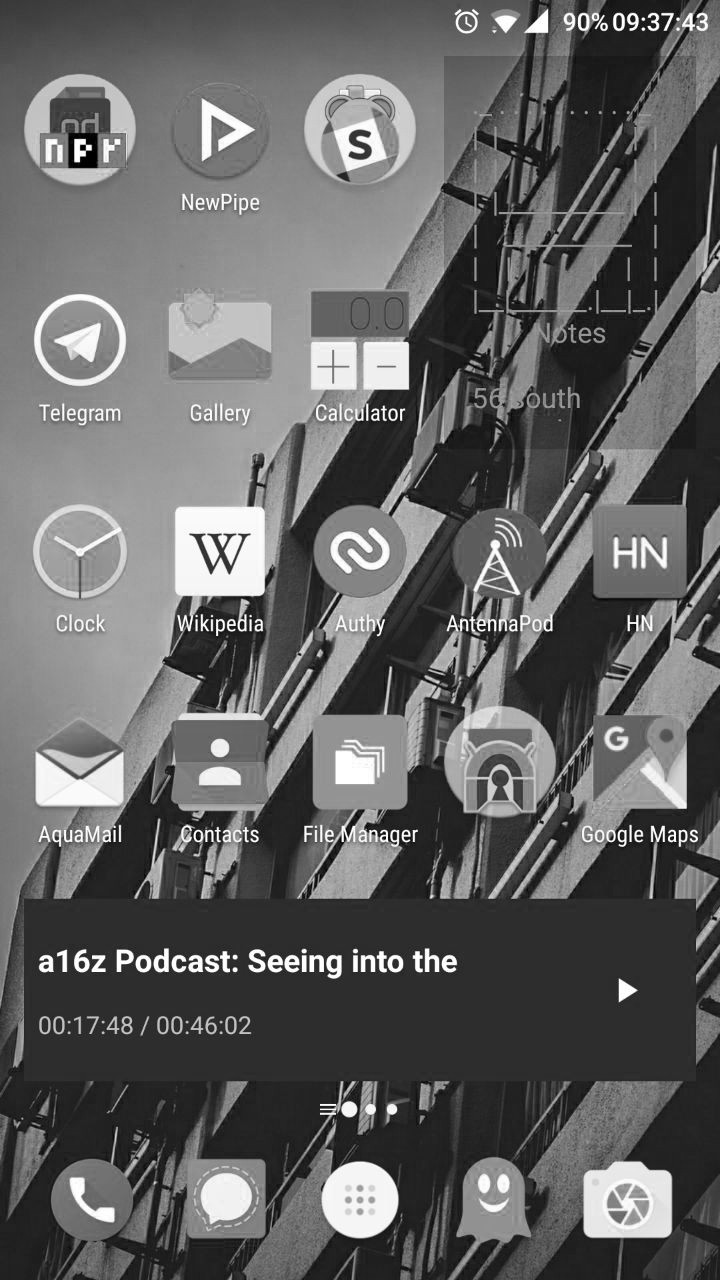
I've always like black and white filters and never had the aversion that some people have to colorless films. That being said, I'm writing this article in a colorful IDE and I often work in a color-coded Terminal. When I first enabled monochromancy on my phone, I imagined I would run into a rash of problems. I was paranoid that half my apps would be unusable or there would be some strange side effects with the rendering. I even thought I noticed an increase in battery drain, but that turned out to be a non-issue. (It seems battery gains can be made on OLEDs, but not LED screens). Several weeks in and it still runs great. I've become quite fond of the simplicity, seriousness, and almost artful vibe of my phone. When reading, I feel as comfortable as if it were e-ink. Push notifications still trigger my attention, but none of the apps seem to call out to me like they did with color.
One distinct change in my phone usage optimization, was that flux didn't really work. There is no longer an orange hue, only a dim. It's hard to tell if it has been any less effective, but a dim white screen doesn't seem to disrupt my sleep cycle I have been carefully managing by getting to bed regularly, regulating caffeine intake, and eliminating the artificial light in my bedroom. I've considered getting an ambient flux-like LED system for my room, but that's a project for another day. The software is still crucial on my still-colorful laptops and PCs.
PagerDuty is the one pain that I hadn't anticipated. Being on-call for server support issues has meant that quick analysis of text messages and Slack messages in the middle of the night is pretty important. It's cognitively difficult enough to be jolted awake let alone understand the implication of an alert before you get your glasses on. Being able to decipher red from green turned out to be critical. I learned that my team really needed to tune our alerts to be quickly comprehended. It may seem strange that 'Resolved' and 'Triggered' would look similar, but the colored bars next to them had truly become a crutch I had used. I suppose that production-environment fire alerts are one thing that I still want to jolt me to attention. For now, a loud buzzer has worked as an adequate replacement.
- Monochrome is a great way to clean up a noisy interface: I can only handle looking at so many things at a time. By limiting the palette to greys, I found that I could easily read for long periods of time. It isn't as effortless as reading a nice yellow-stained novel, but it does make up for some of the color choices that web designers make.
- I don't need an e-ink device: Despite several new e-ink devices hitting the market like the reMarkable and the Sony DPT-CP1, I feel like I have gotten a similar benefit out of just turning off the color on my phone. It helps that my handwriting is garbage anyway.
- I need color for real computing: I have yet to be able to disable color on all of my devices. Programming and gaming have benefits to color usage that casual apps do not. Trying to use my MacBook in the desaturated mode gave me a headache pretty quick.
- Color is helpful for my job: Distracting as it may be, I have found that putting color notifications on important applications like PagerDuty has helped me prioritize work and respond to important issues quickly.
- I wish I could be selective: Some apps (like Slack) really need to be monochrome, while others (like my terminal) can stay colored. I don't know of any selective greyscaling software, but that would be pretty nifty.
OSX: Go to System Preferences -> Accessibility -> Display -> Use Greyscale
Android (7.0 at least): Go to Settings -> Developer Options -> Simulate Color Space -> Monochromancy
iOS: Go to Settings -> General -> Accessibility -> Display Accommodations -> Color Filters
Ubuntu XFCE: Not tested yet
This was an interesting and pretty simple way to change how I interact with the buzzer in my pocket. Maybe I'll put an update in here after a couple months of using it.
It's worth noting that the OnePlus 7T has several monochrome options available from the top pull-down menu. Such a small feature to implement, but wonderful all the same. I never did implement the pull down button on my old OnePlus. I guess I wasn't cut out for mobile dev.