A new art supply shop opened in town recently, stocking high quality materials and providing a space for art shows and workshops. I'd expressed interest in print making and photography classes to the shop owners so when, last month, their newsletter announced a linocut class, my wife Y and I signed up within about 10 minutes of the email hitting my inbox.
I've always been fascinated by the engraved art style (which explains why many of my tattoos being based on woodcuts). But I'd never much pursued the craft beyond emulating the style in pen and ink. Y, however spent many an hour of her junior high school days carving rubber stamps, many of which survive to this day squirreled away in an ink-stained shoebox.
Linocut was a new medium to both of us. With linocut, the crafter takes a ~1 cm (?) thick piece of burlap-backed linoleum and carves away the negative space to create an image positive block that can be inked for any number of prints. Ink is forced onto the paper using the pressure of one's hands (such as with a baren) or with the help of a lever (via a press).
This post is going to be a recounting of our experience interwoven with some of the tips we found most useful/relevant to our DIY printmaking.
Before we got to class, we knew we wanted to have a design set down so we could spend as much of the class doing the cutting and printing. So what to make? Another frog? I pretty much immediately knew I wanted to give making a personal bookplate a proper effort. I'd made some digitally produced, inkjet-printed bookplates while Y was pregnant with our son. But the designs were a little dated.
An old design I'd made for my son's bookplate. He son didn't take to the dino stuffie like we thought he would!
I knew I could do a better job with two 3 hour classes to dedicate to the effort. And we have hundreds (thousands, maybe?) of books so the artwork would certainly be put to use!
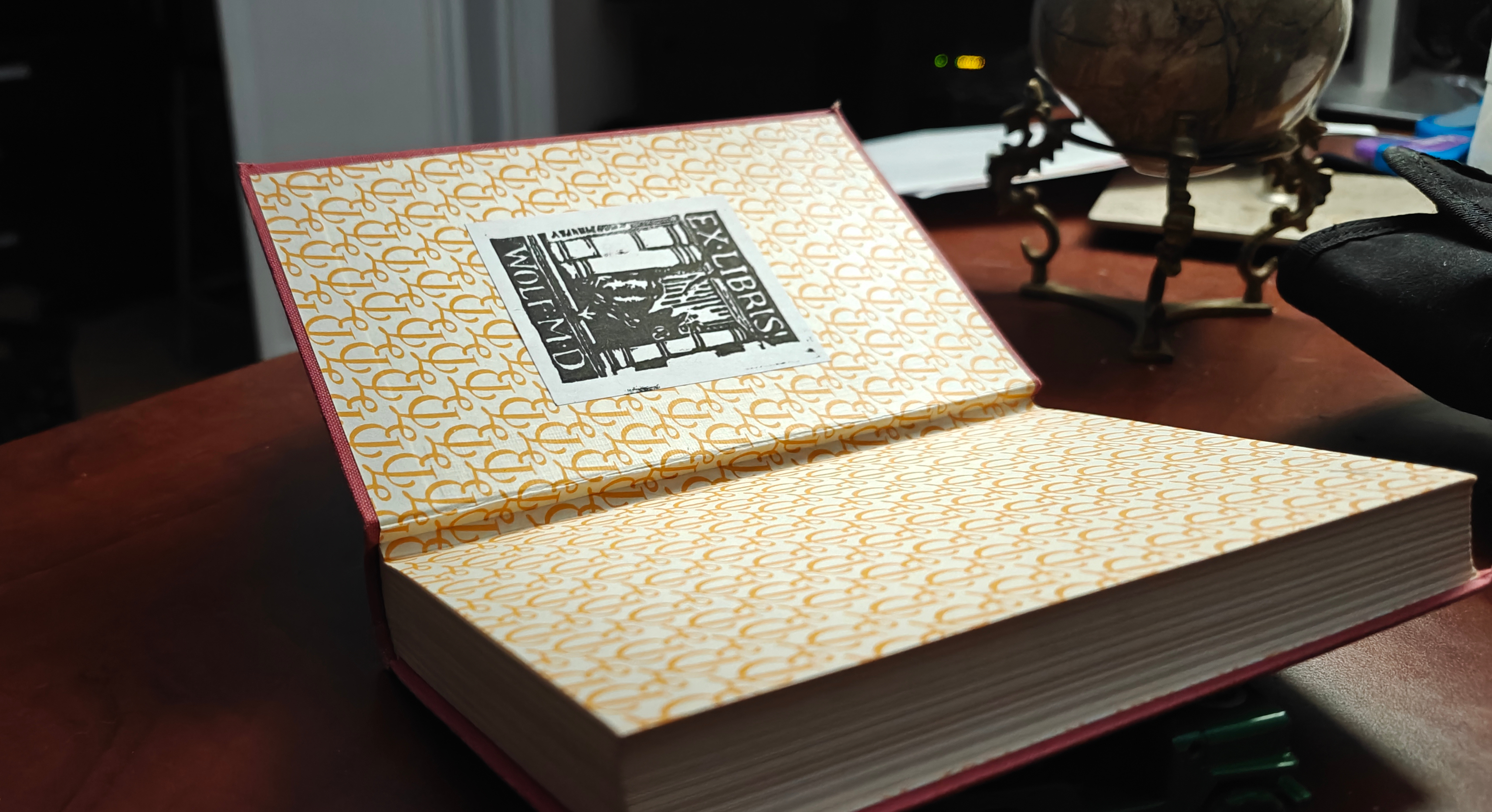
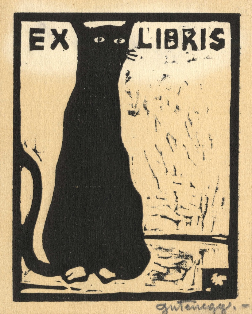
A bookplate or ex libris is a unique, often ornately decorated tags indicating the owner of a book. While I haven't come across many modern bookplates (perhaps the original owners still have them or people just don't make custom nametags on things anymore), I have a pretty extensive collection among my used library. I have also found bookshops in Prague and Rome which sold bookplates (probably just reprints but still awesome) from folks who did a bang up job of putting their personal stamp on their books. Prague in particular had a number of the linocut-style bookplates which may be in part due to the influence of Vojtěch Preissig or simply the fashionable (and inexpensive) style at the time when most surviving bookplates were minted. If anyone knows more about the history of linocut in central/eastern Europe, let me know!
I've misplaced the bookplates I bought in Europe but if I find them I will put them here instead
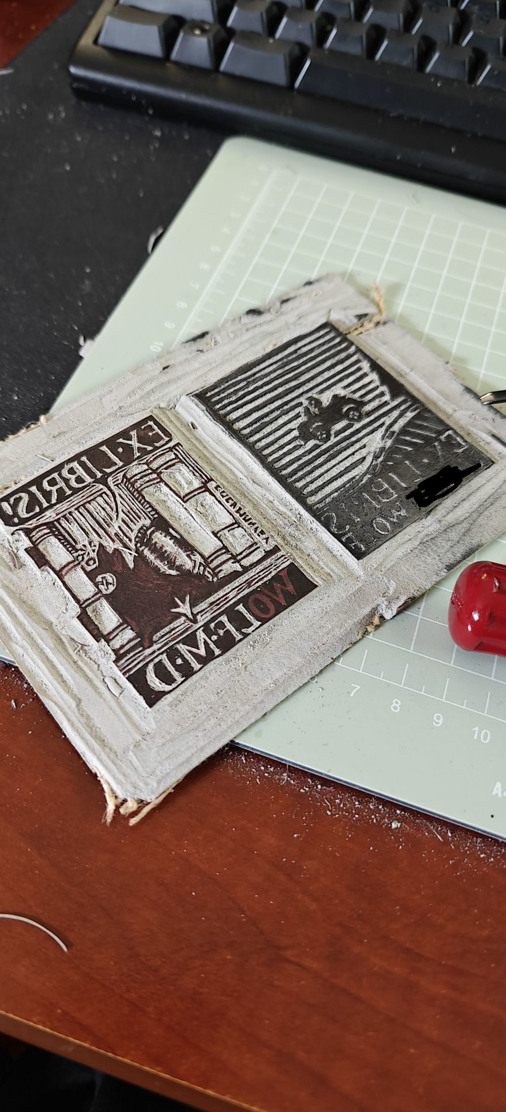
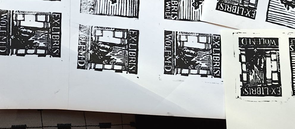
It was this tradition of using linocut for ex libris designs that gave me the confidence to work at this scale on my first linocut project. Unfortunately, I really like detail and square edges so I was going to give myself a lot of work. The class was going to provide 4x6" linoleum blocks. So we aimed to each create two bookplate designs on each block, one for ourselves and one for our son. And it wouldn't be a competition. Of course not.
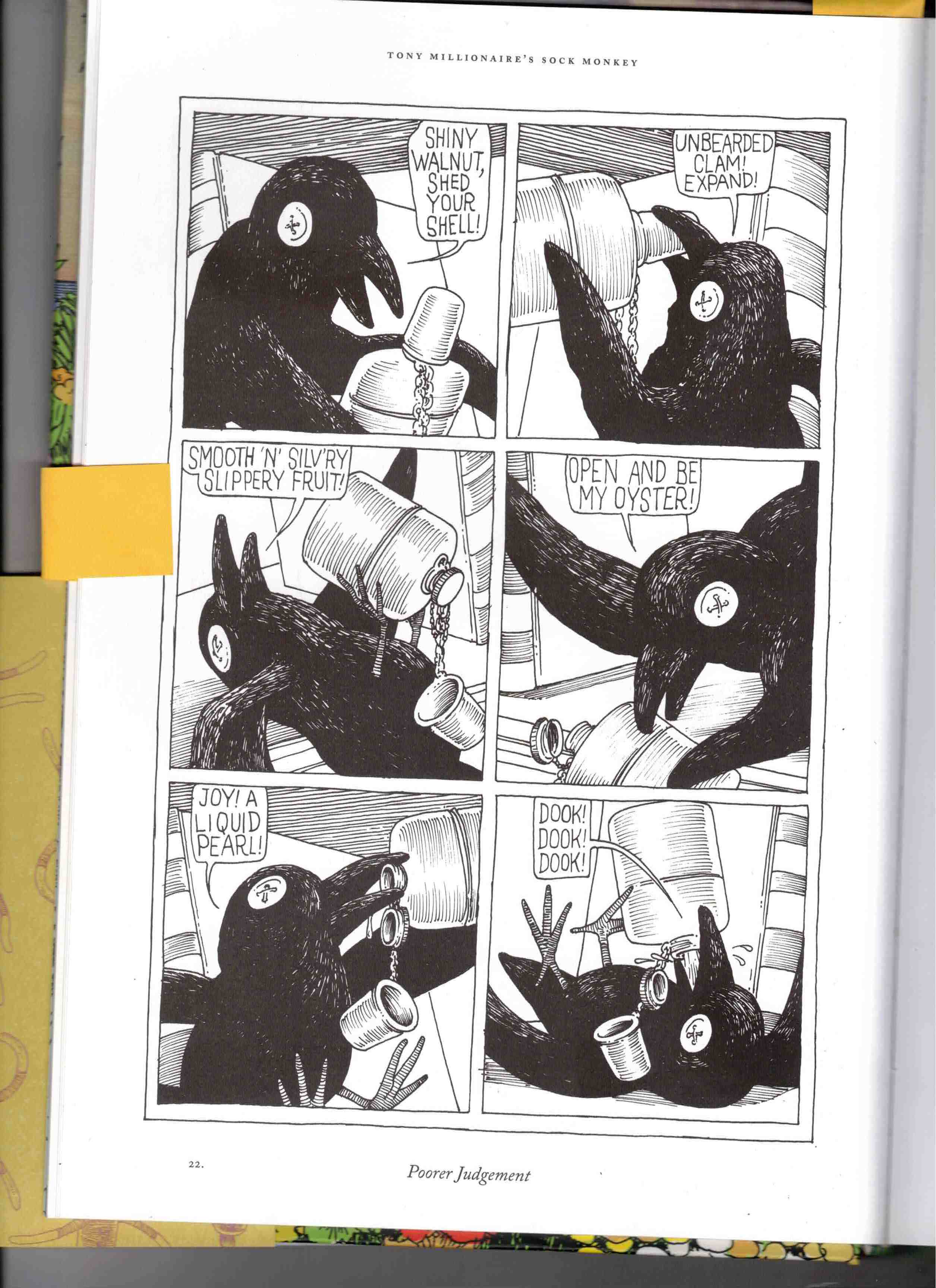
We wanted our designs to be unique and somewhat reflective of ourselves and the lad. I noodled on the idea of a crow for a while before realizing that, similar to tattoo ideas, the kinda silly ones always end up being the best. So I thought back to Mr. Crow, the stuffed corvid from Tony Millionaire's Sock Monkey. Tony Millionaire's art and writing is just incredible. I ended up rereading the Sock Monkey compendiums we had on the shelf while looking for inspiration. It exudes all of the elaborate engraving-style pen and ink artistry that I could only dream of recreating myself. So I only felt a little bad ripping his character off. Mr Crow lost in drink in a bookcase seemed a good enough design for myself.
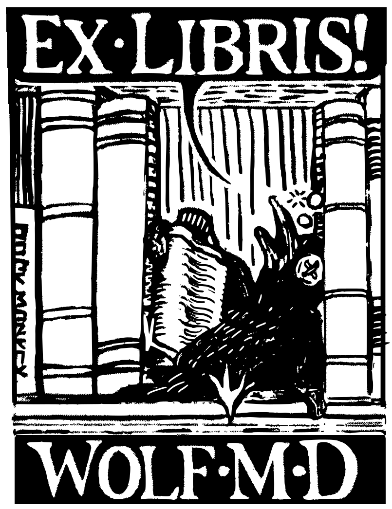
Please forgive my reproduction and cheap homage, Mr Millionaire
I knew the design for my son's ex libris pretty much instantly. Those with young children may be familiar with Sago Mini World, a kids game featuring flatly designed animal characters interacting with a variety of minigames. The lad is a big fan of the Road Trip game in which he picks a vehicle, packs a suitcase and takes Jinja the cat on a hilly adventure. But of course physics are light and he often takes the vehicles flying up in the air. I tried to capture the whimsey and minimalist design of the game with Jinja the cat in a convertable hovering over a hilly road.
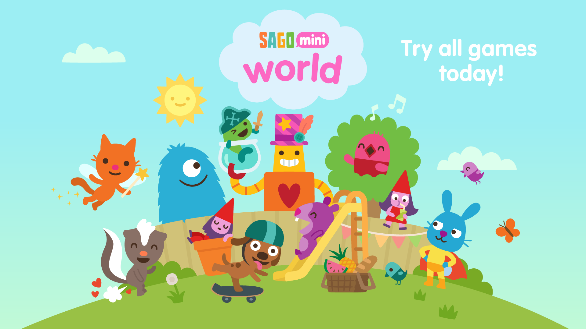


Y's piece for the kid also features a Sago Mini scene. This time it's Harvey the dog floating in the game Space Explorers. She rendered "ex libris" into the Sago Mini typeface and basically showed me up with her detail and use of negative space. But for her own bookplate (not that she reads much) Y ripped an MC Escher bookplate design. I said we'd make something unique, not original! She replaced the caterpillar with a White's tree frog poised to eat a cricket.


We decided to keep most of the text in the same font, Burgundia, a fairly basic serif font by Måns Grebäck. Of course serifs would be harder to carve, but they do look snazzier for something like this. So after scanning in our designs, touching them up a bit, overlaying the text digitally, scaling the images down to the desired 3x4" size, and, crucially, reversing the image, we printed out a few copies of each design using a laser printer and were ready for class.
We had a cozy little class of 5, with ourselves being the only non-retirees in attendance. Chris Dacre, a passionate printmaker, art teacher at the local community college, and overall chill instructorman led us through a brief history of engraving and printmaking, the relevance of the paper on the print (eg thin paper shows detail more easily), and innumerable tips and tricks. We were given time run a full piece through the process using his fancy Japanese carving tools and woodzilla press. Importantly, Chris gave us the confidence to continue, assuring us that our designs wouldn't be fully impossible to carry out.
Finally, we were given the mandate (or really, more of the suggestion) to produce a block that we could then print together in class the following week. Since we already had our designs, the greatest hurdle was already over. It was time to carve a block.
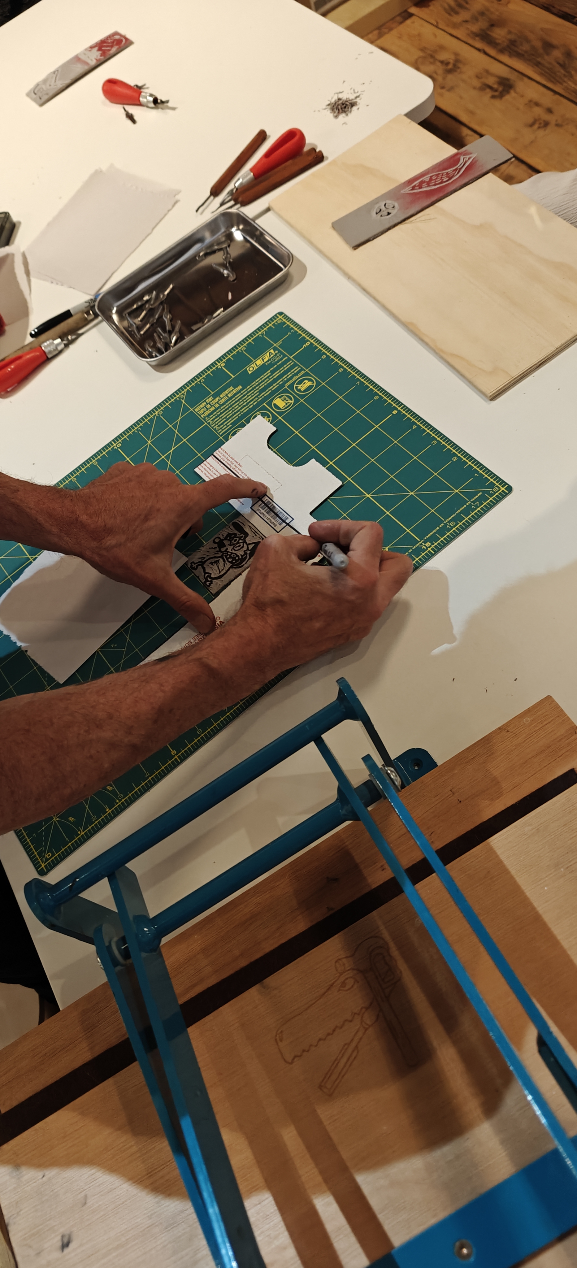
To have a guide of what to carve out, it helps to transfer the image of the design to the linoleum. One can free-hand of course, but not all of us are so skilled as to be able to carve without a pattern to follow.
Incredibly important! Make sure to mirror your design before placing it on a block! Otherwise your image will be backwards when it is used to stamp. I made this incredibly sophmoric mistake on a new block even as I was composing this blog post. But on the upside I now I have a template to transfer to a different block!
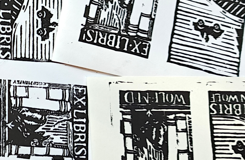
Once you've got your design reversed, you can take a couple of approaches in transferring.One method of sneaking an image from paper onto the block is to use a fresh toner copy of the image and Citrasolv (tutorial) bleed the ink over. We gave this a shot but either the knock-off solvent we found or the toner in our Brother printer wasn't right. We only got an unworkable phantom stencil. We moved on to the time-consuming home-brewed graphite paper method. This involves covering the backside of the image with dark (such as a 2B) pencil shading, placing the printout on the block with the graphite-covered side facing the linoleum, and tracing the image. It helps to tape the print-out down to prevent the stencil from shifting. The trace doesn't need to be perfect, but once complete you should have some pretty visible graphite lines on the linoleum to then render more permanent with ink (Pigma Micron suggested).
So after we were pretty sick of our designs, having rendered them by hand multiple times now to get to the point of having inked outlines on linoleum, it was almost time to start cutting. We would be carefully removing layers of linoleum so making sure we knew what was already removed would be critical. While the depth is somewhat easy to tell and it's no problem to ink the block, test, and continue cutting, our guru had given us a sweet tip: Rub red acrylic paint into the block with a rag. Black positive remains visible while the red space becomes negative. Any red that remains is positive so by stripping away all of the red linoleum we should be left with our desired image.
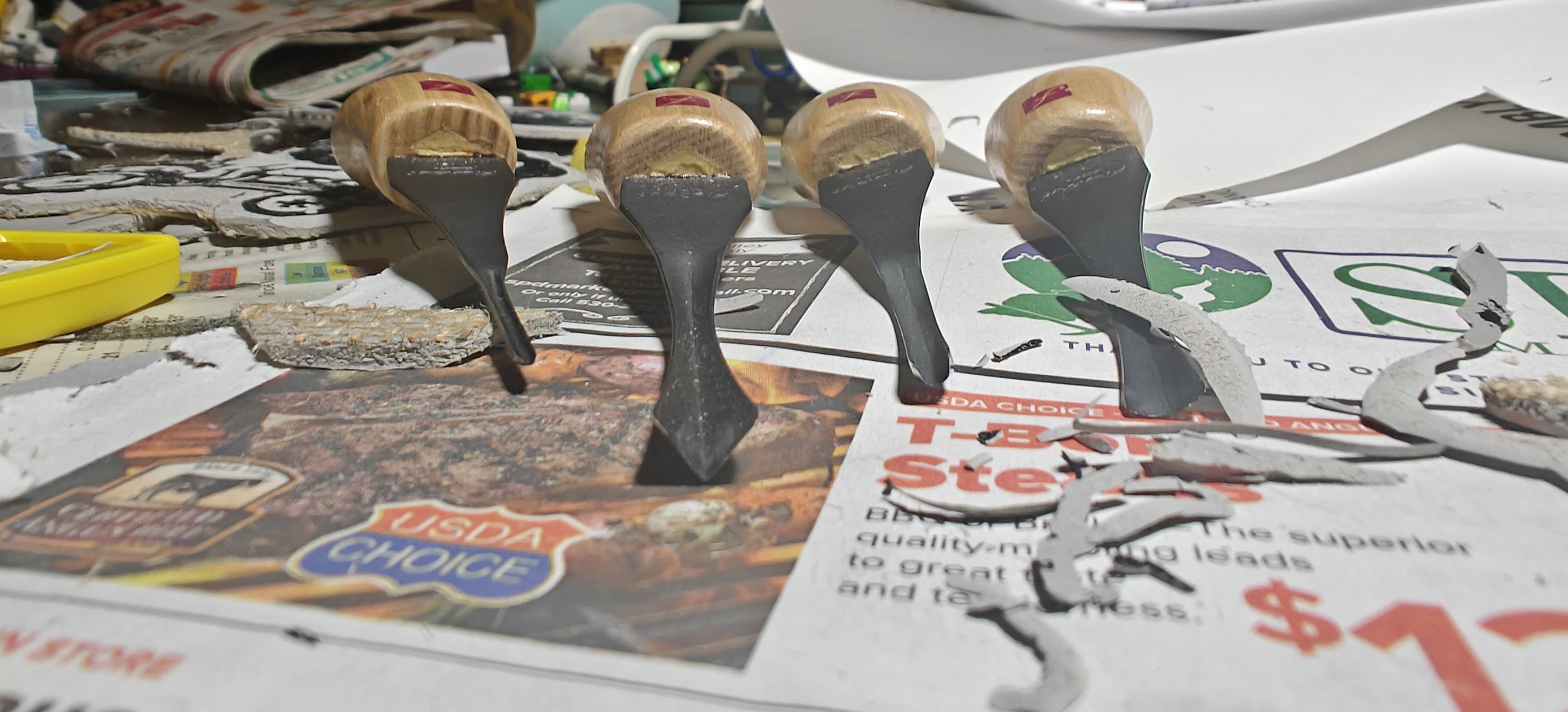
By taking a cutting tool in the palm and pressing down with the thumb, one is able to get fairly precise cuts in the linoleum. Having a decent array of U-shaped and V-shaped gouges, we were able to render a decent amount of detail without having to worry if the cuts would be deep enough to print well. In my masochistic fashion, I found that much of my lettering did need to have the fine detailing of a pen knife. In order to dig the characters out deep enough for them to have a fighting chance of producing a legible print, I had to go over them numerous times. Lettering in negative space (ie cutting out the letters from the block) is much easier than the other way around, but it is still pretty painful!
As evidenced in many specimens of linocut design, a strong point of the artform is in making the organic patterns of feathers and fur. So putting in the feather details of Mr. Crow was substantially more enjoyable than meticulously driving the straight lines of the books and book shelf.
Tip: Don't put fingers or other treasured possessions in front of your blade. Easier said than done but the gouge is very liable to slip and bite into anything in its path. It's little wonder the Flexcut gouges we got came with bandaids inside!
When the image is mostly complete, it pays off to scrape down any large negative spaces with a flat blade gouge to prevent the peaks between U-gouge troughs from showing up when inked. We didn't cut down our blocks as we had decided on rectangular pieces that fit well within the 4x6 blocks we chose. But for odd shaped pieces, cutting the block to remove large unused borders can prevent anything unwanted from picking up ink.
Even after a block has been inked, it can still be cut down later (in fact there's a whole process dedicated to this idea, known as reduction printing) so it's okay to be somewhat conservative with cuts in the initial pass with the block.
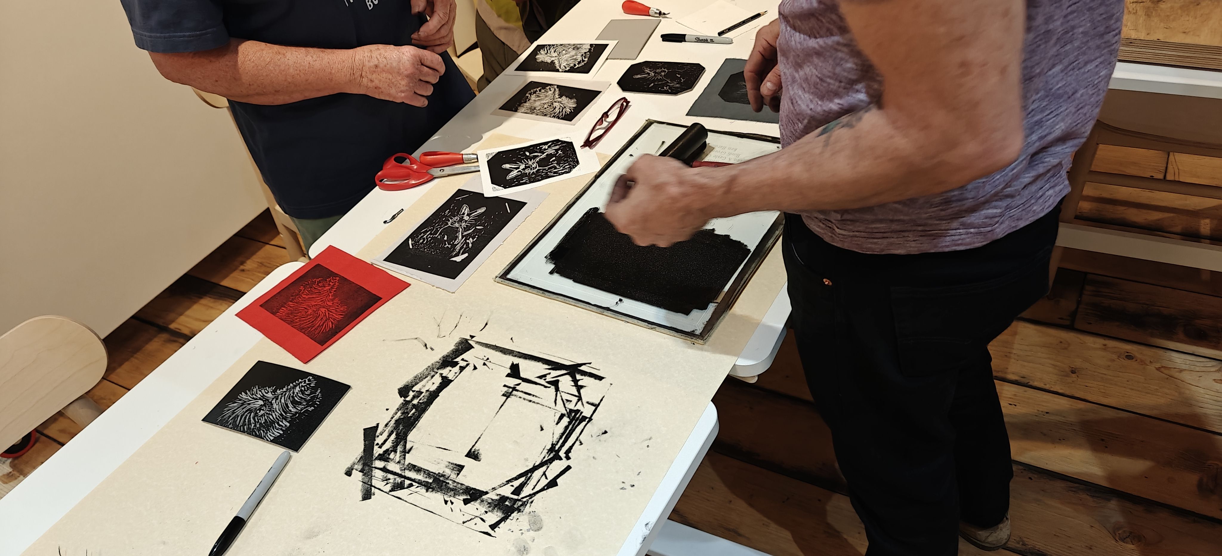
Only two of the other brave souls in the linocut class made it to week two. This class was dedicated to printing the blocks that we'd produced, refining the blocks, and honing our inking skills. But one student who didn't have time to make a block during the week was still able to design, carve, and print a lovely little wren within the few hours we had in the classroom. While I was obviously excited to get my blocks reproduced onto paper, I was equally looking forward to the designs produced by everyone else. Linocut, as any open-ended artistic medium, provides a lot of opportunity for personality. If it doesn't explicitly reward experimentation with clean prints, it at least leads to an exciting experience as the paper is removed from the block and a print is born.
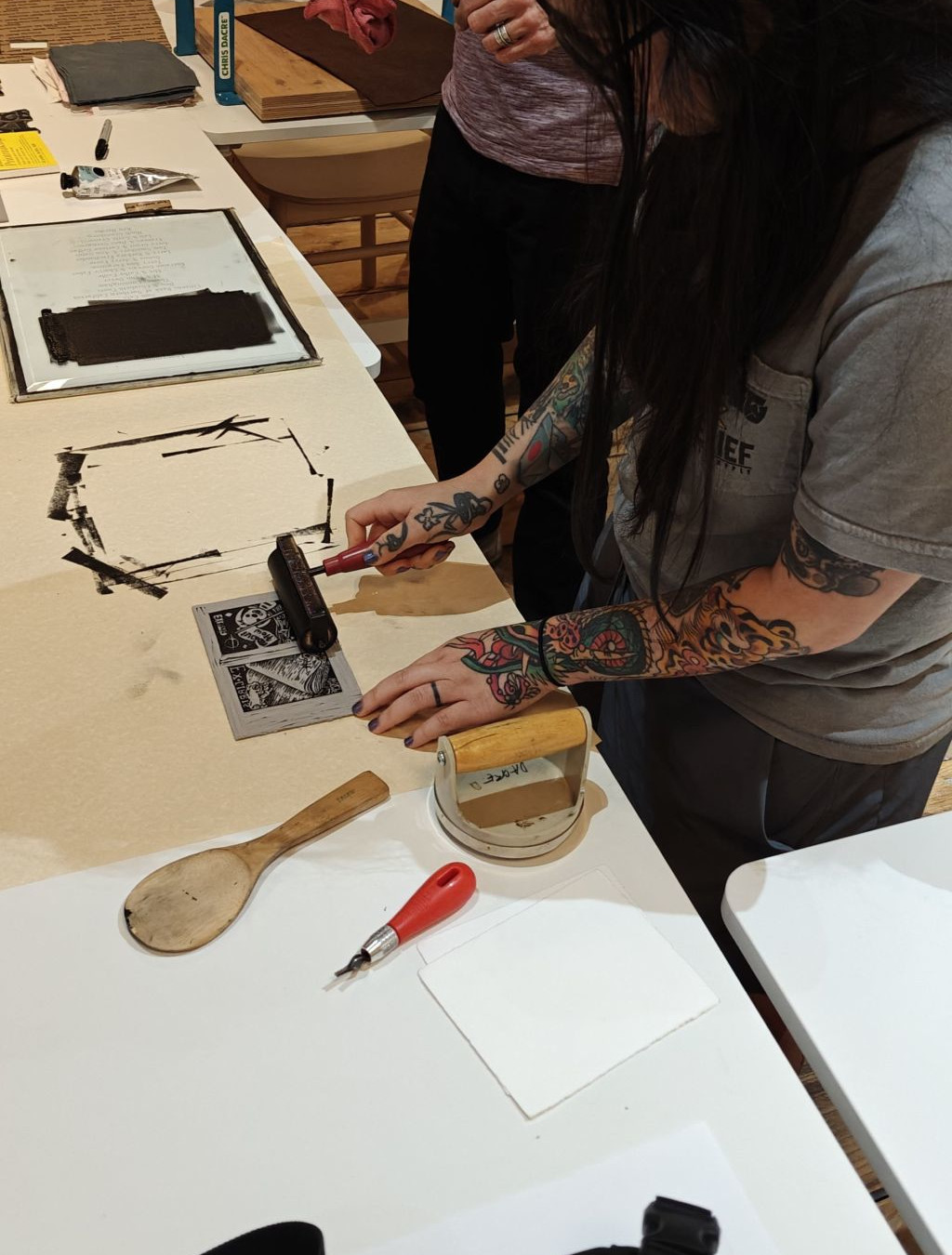
Beyond getting a feel for the process and the many ways of putting a block on paper, Printmaster Chris explained the differences in western and eastern papers and how weight impacts how an image is transferred. While I'm personally partial to the feel of heavier, European cotton paper, thinner papers such as newsprint tend to show a greater amount of detail from the inked block. Since Y and I were making bookplates that would be stuck to the inside of our books, I decided to be kinda cheap and bring in some sticker paper to print on. Our instructor, who is a connoisseur of fine paper, deckle edges (ew), and traditional printmaking, was a bit skeptical that we could get a good print on the Avery sheets. While it took a few attempts, we were able to get some clean looking renders. Not as pretty as on the newsprint or even the cotton printmaking paper, but certainly functional!
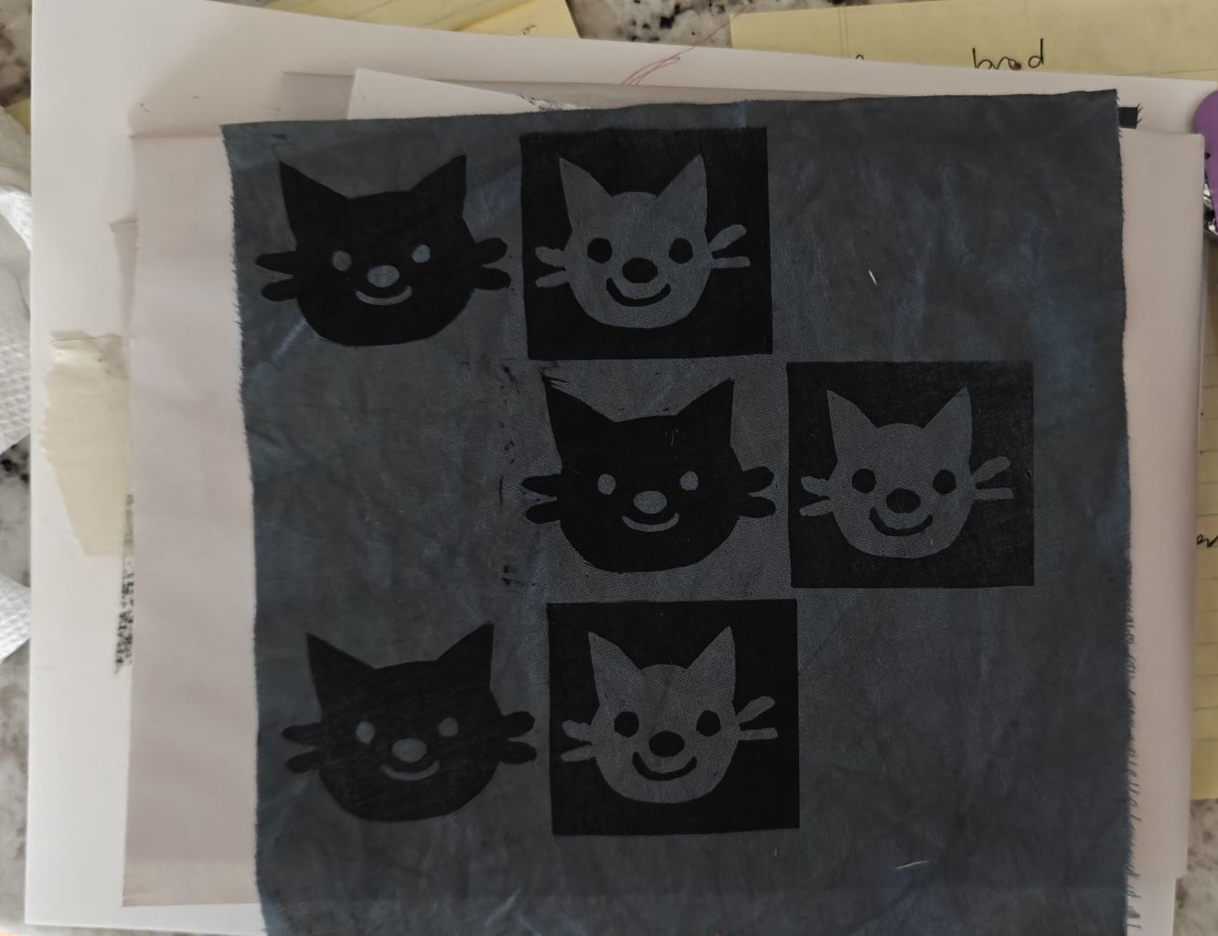
As it goes with many of our hobbies, I was industrious in class while Y was meticulous. By the end of the class I had made several dozen passable prints while she made maybe five immaculate ones. As one who "prefers the cutting more than the printing", she also made another positive/negative exercise block for fun and printed it on some fabric.
By the end of the class, we'd made some new friends in the community and came away with some pretty decent prints and the confidence to make more in the future. We're contemplating taking another Professor Chris art class at the local community college if they ever have one that doesn't start at at 0800!
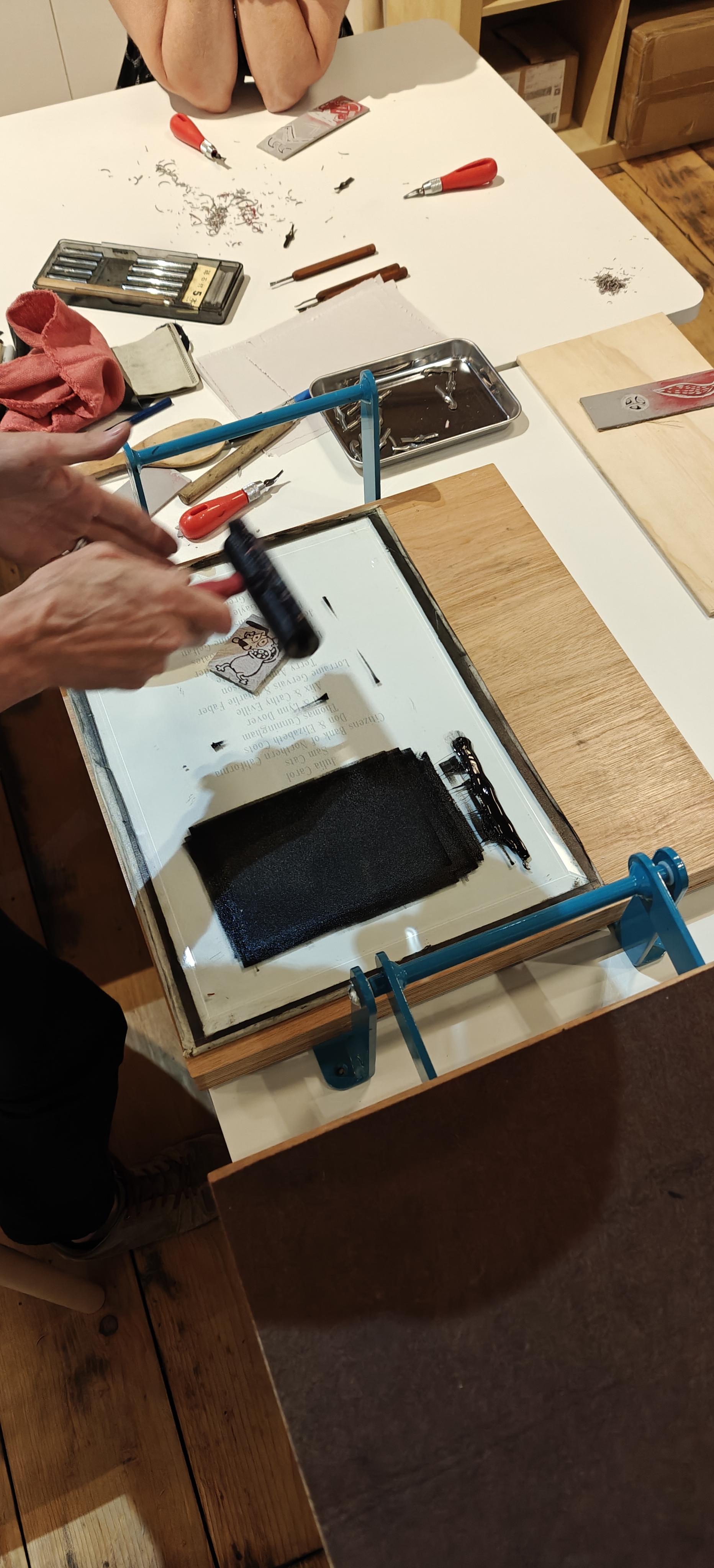
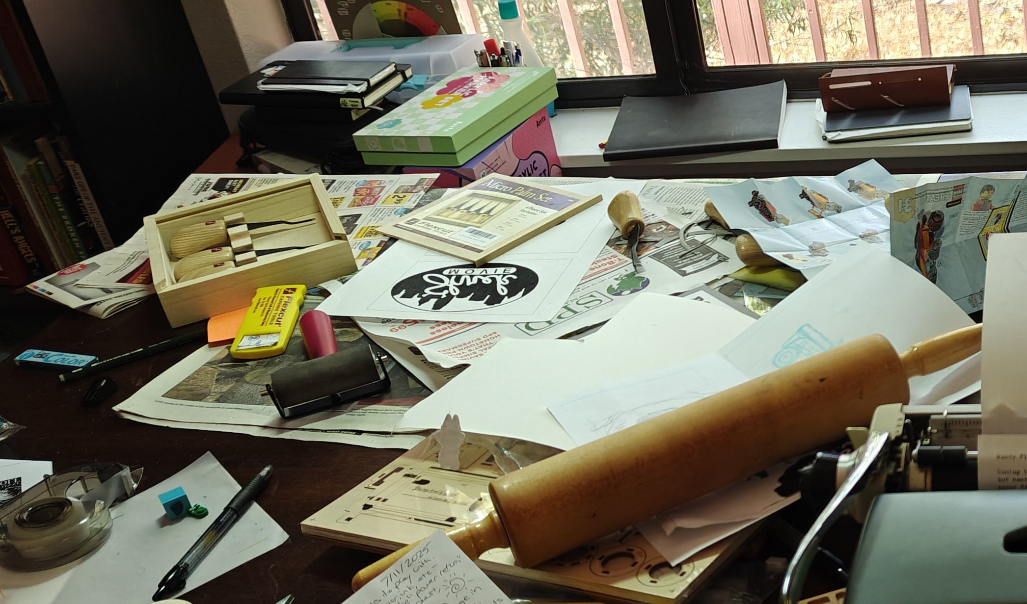
After the linoleum blocks are carved, it's time for the fun part: putting ink to block to paper. Before getting started, a few materials are required (and a few others are useful).
- One or more linoleum blocks carved with the mirror image of what you want to see on the paper
- Ink (generally one color for a simple print). Any relief ink will work, but our guru recommends Cranfield Caligo Safe Wash Ink and I must agree it does what ink is supposed to do. I haven't experimented with other kinds of ink.
- A
- An inking surface/palette ie a flat surface that you will be using to roll ink onto your brayer. I took the glass out of a ~8.5 x 11" picture frame and put tape around the edges to prevent any accidental lacerations.
- Paper you'd like to print on
- A tool to aid with pressing the paper onto the block: this could be a full-on wood lino press, a baren, a flat wood spoon, or a willingness to exert a lot of force on your knuckles on each print. I had mixed success with a rolling pin
- A template, if you so choose. This allows you to line up each sheet of paper to the block in the same location. We used an L-shaped piece of cardboard-- something easy to find and cut to size and, importantly, something that is okay to get a little inked up. People get really into print placement for serious print jobs, but if you're just toying around, no need to be consistent.
- Newsprint or other throw-away paper to be used to keep ink off your workspace
- Clothes that can get an inky badge of honor or a work apron
Once you've got your supplies together clear enough space in your work area to lay out your tools in an organized fashion. There may be a few moving inky pieces so allocating a spot for your brayer, your block(s), your blank paper, and (if you have one) a drying rack for your finished prints will help avoid making too much of a mess. Part of small-edition printmaking's charm is the imperfections, though. It's worthwhile to treat it like Japanesse caligraphy where the ink enters the paper in a deliberate, but often unexpected strooke. At least I tell myself that to justify my ink blots ex post facto.
This is a messy workspace. You can do better!
Hopefully, you're now emotionally prepared yourself to make some prints. I'll assume this is a hand-print job without the ease of a lino press.
- Set your carved block on the workplace, carved side up. Take a dry run of laying the paper atop the block to make sure everything fits nicely before the ink come out. Then set the paper to the side.
- Open your ink tube and lay out maybe a worm of ink about the width of your brayer's roller on the top half of your glass palette. The ink (or at least the Cranfield stuff) doesn't dry quickly on the glass or don't feel the need to rush hereafter.
- Take the brayer and roll it from the top of the palette , through the ink until the roller is completely coated. Pick the brayer up from the palette and repeat until there is an even rectangle of ink on the palette and the roller. Rolling the brayer back and forth across the ink is not advised as it can spread the ink unevenly on the roller. A trained ear is as useful as the eyes when identifying if enough ink is on the brayer. I think it sounds kinda like a chorus of crickets but maybe more like the sound of peeling painter's tape. Regardless, you want to make sure a good, even amount of ink is on the brayer. Moving the brayer quickly will remove ink while moving it slowly will add ink.
- Roll the brayer across your carved block to distribute and even amount of ink on it. Again, try starting from one side and going across rather than back-and-forth. However it doesn't hurt to take perpendicular passes to make sure all of the indended block is inked up evenly
- Gently lay your paper down on the block (using your template as an alignment guide if you have one). Try not to shift the paper once it has come in contact with the block to avoid smudging. Holding the paper toward the block at an angle and bringing it down to parallel with the block naturally works pretty well.
- Using your pressing tool of choice (baren, wooden spoon, knuckles etc), push the paper firmly into the block. Even with fairly thick cotton paper your should be able to see the ink through the paper. Try to cover the entirety of the block without shifting the paper. The ink does a fairly good job of holding the paper in place.
- Lift the paper off gently. I've had good luck picking it up from a short edge.
- Review the print. Are there any unintentionally dappled spots with insufficient ink or splotchy bits? Does the block need to be carved out further? Adjust the amount of ink on the brayer and block as needed for the next print.
- Set the print aside or on the drying rack and repeat from step 3 until you've completed your desired number of prints or you've exhausted your ink or your patience.
At this point the print run is complete with a stack of inky paper testifying to likely hours of work designing, carving, printing, refining, printing, and printing. It's good to clean up the workspace. The Cranfield ink washes of a glass palette easily. I wasn't able to clean my brayer back to new-in-box pink but it now at least has a consistent grey tint.
After the basic process and vague parameters of print-renderingis understood, it's easy to iterate. Fine lines are absolutely possible if one is patient. Using more than a single color is possible both through reduction printing or carving multiple separate blocks. Completed blocks can be stored indefinitely as long as they are kept in a relatively dry area. I've personally embarked on a few new block carvings and tried out fancy transparent linoleum from Blick. It's certainly not as exact or quick as printing out the original digital design, but carving by hand is a lot more fun.
- Do not wash your block - the burlap on the back of the standard linoleum blocks will contract when it gets wet. This means the block will permanently curl and be very hard to print with again.
- Try to set the brayer down (and store it) with the metal part of the hand on the table so the weight of the tool does not warp the cylindrical shape of the roller